Customer-facing Rewards
Customer-facing Rewards
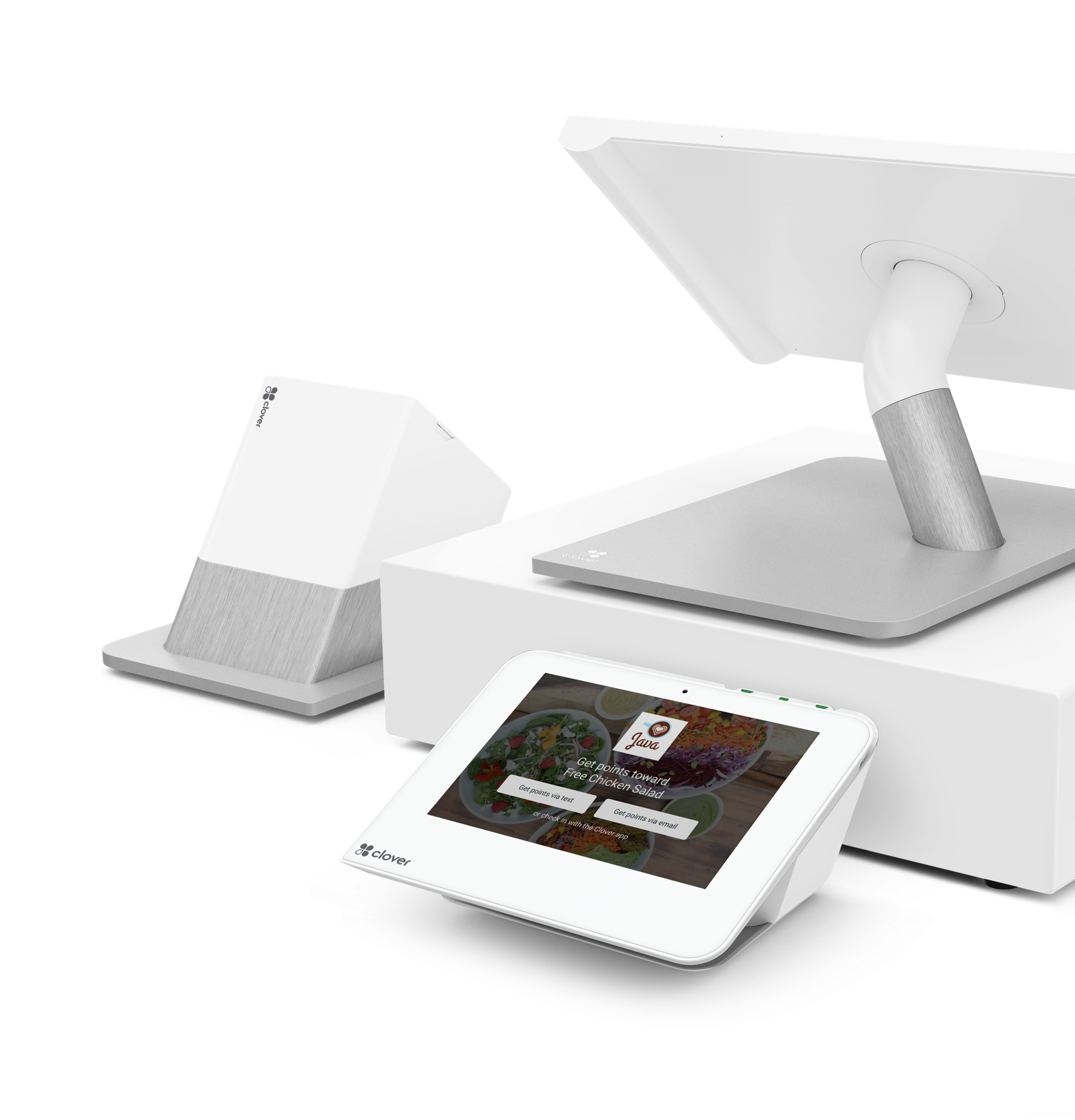
AT COUNTER EXPERIENCE
AT COUNTER EXPERIENCE
INTRODUCTION & GOAL
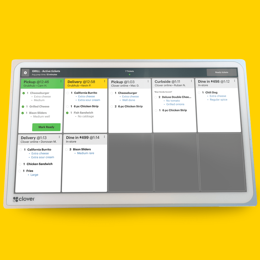
When the Perka loyalty app was fully integrated into the Clover point of sales platform, our potential customer base had increased 10x. We now had consumer touchpoints that wouldn’t require a download from the app store. A very natural touchpoint became the point of sale itself, at the counter.
Of course, this came with inherent challenges. To bring rewards to the counter, we would have to create a secondary flow that did not distract customers from the real-life transaction, or bring the merchant’s line to a halt. Any prompts for the rewards program could not be interruptive, but instead supplementary to the exchange between the customer and merchant.
PROCESS & EXPERIENCE
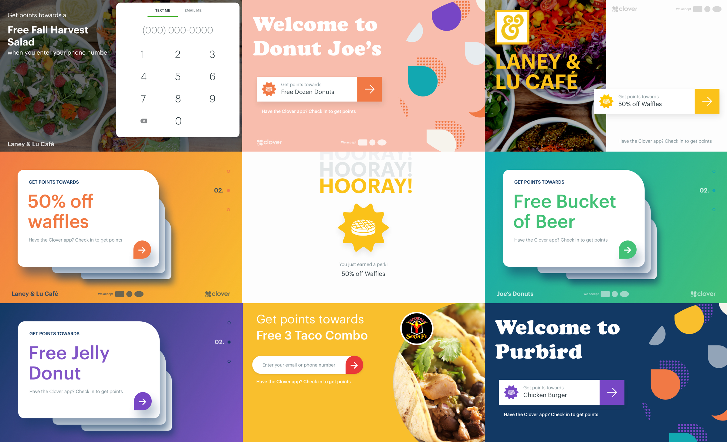
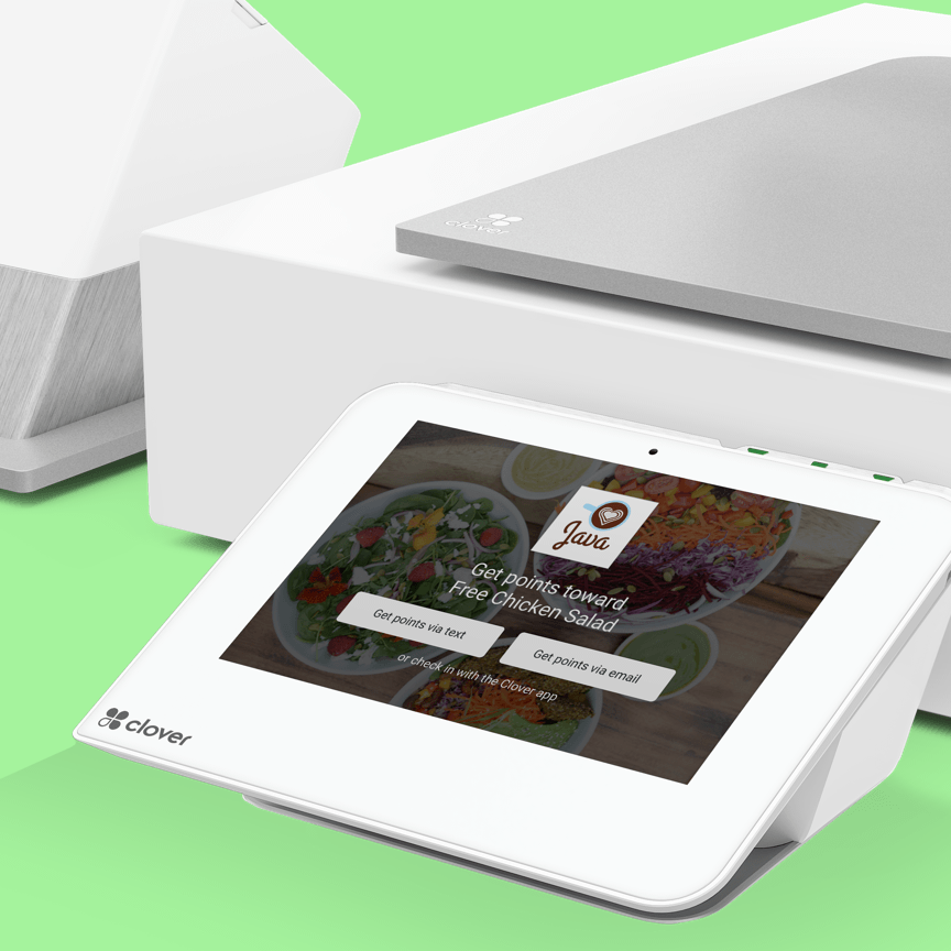
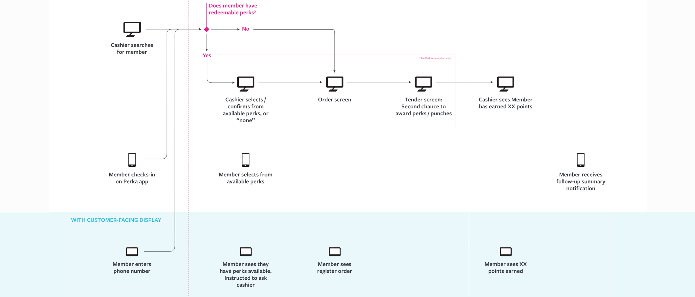
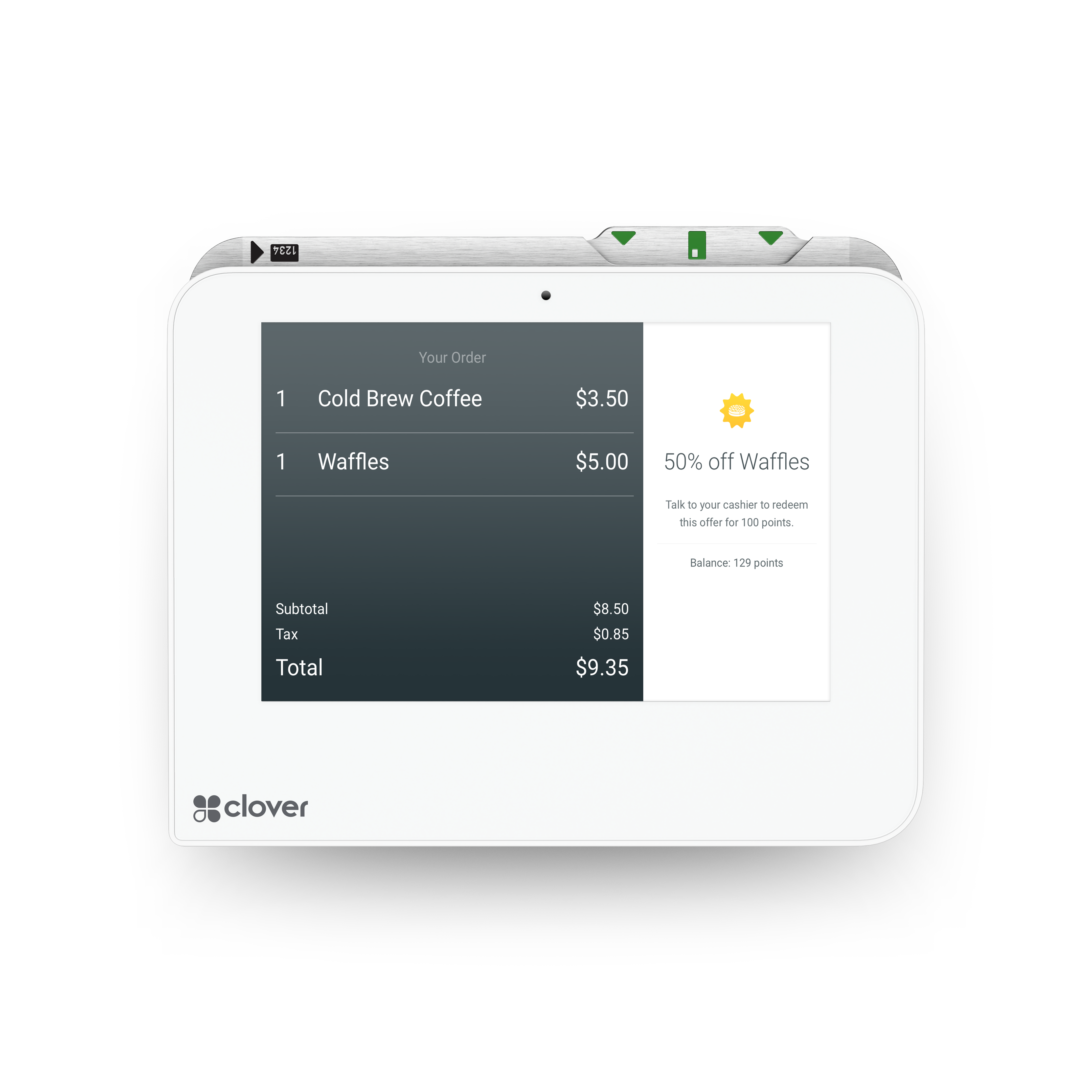
Since our customer-facing display had to show a summary of the active order in real time, I set out to create a flexible check-in flow that would adapt around any transaction activity. Customers would get a simple message to check-in to earn a perk that the merchant had set up.
Aside from a call to action to begin, all other check-in UI would be introduced through progressive disclosure. When there was no active order, the full screen could be taken advantage of, repurposing any brand assets the merchant may have uploaded.
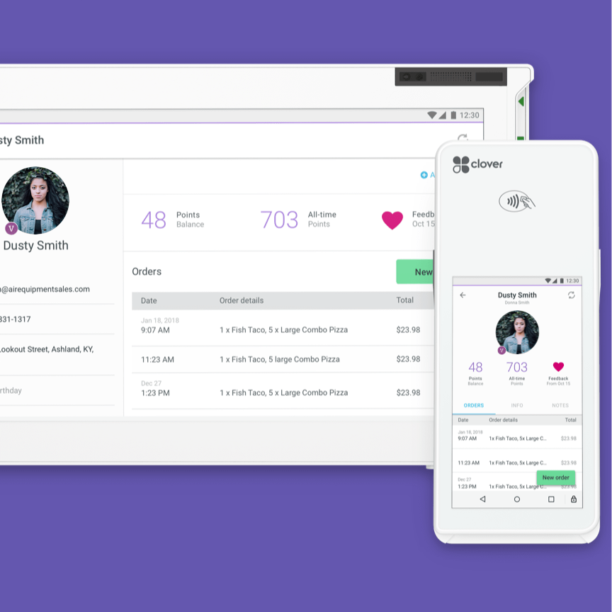
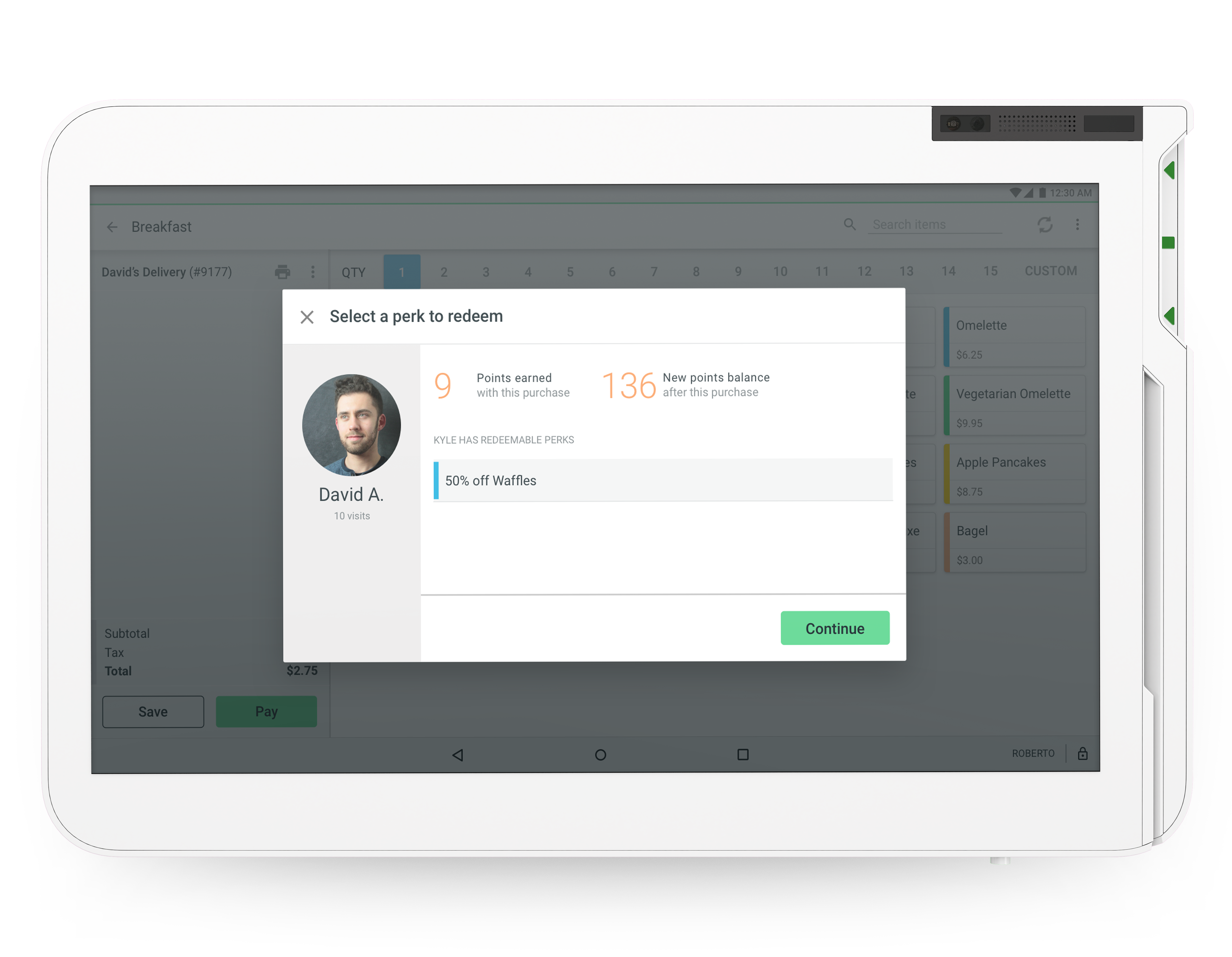
In order to make sure this experience facilitated the relationship between the merchant and customer, my team decided the merchant should be notified of a customer check-in, which would hopefully direct their conversation. If the customer was already an active member of the rewards program, the merchant could easily see if they had any rewards ready for redemption.
THE OUTCOME
After an initial pilot release to 100 merchants and follow-up interviews, two major takeaways were:
• The customer-facing display was a far more effective enrollment path, due to the reduced barrier of entry.
• The unobtrusive design meant that some customers were totally unaware of the check-in UI once their order began. This led us to add subtle animations, and create enrollment paths in digital receipts post transaction.
A year after release, merchants with the customer-facing rewards experience saw 124% more enrollments than those without it, and check-in activity by rewards members was 4x higher on customer-facing displays than other touchpoints.
Subsequent efforts have been made around expanding this functionality to other Clover devices, as well as exploring more captivating UI to get the attention of customers before transactions start.
After an initial pilot release to 100 merchants and follow-up interviews, two major takeaways were:
• The customer facing display was a much more effective enrollment path, due to the reduced barrier of entry.
• The unobtrusive design meant that some customers were totally unaware of the check-in UI once their order began. This led us to add subtle animations, and create enrollment paths in digital receipts post transaction.
One year after it’s release, the customer facing rewards experience saw 124% more enrollments than the Clover consumer app or receipts with sign up codes even though it was configured by less than 10% of Rewards merchants.
Subsequent efforts have been around expanding this functionality to other Clover devices, as well as exploring more captivating UI to get the attention of customers before transactions start.
124% increase in customer enrollments.
4x engagement
*Check-ins on customer-facing displays compared
to the native mobile app.
*Check-ins on customer-facing displays compared to the consumer app.